Visualizing
Temporal Data
Information Visualization
John Alexis Guerra Gómez | john.guerra[at]gmail.com | @duto_guerra
https://johnguerra.co/lectures/information_visualization_spring2023/07_Time/
https://johnguerra.co/lectures/information_visualization_spring2023/07_Time/

What We Are Going to Learn
- Line charts
- Area charts
- Other representations
- Radial idioms
- Modern represtations
- HCIL work on temporal
- Tips
Visualizing Time
Temporal Datasets
- One attribute has a timestamp (at any level)
- Granularity ("year/month/day" vs. "year/month/day/hour")
- Truncate
- Datepart
- Sometimes is cyclic
- Seasonality
Line Charts
Idiom: Line Chart/Dot Plot
- One key, one value
- Data: two quantitative attributes
- Mark: points and line connection marks between them
- Channels:
- Aligned lengths to express quant value
- Separated and ordered by key attribute into horizontal regions
- Task: find trend
- Connection marks emphasize ordering of items along key axis by explicitly showing relationship between one item and the next
- Scalability: hundreds of key levels, hundreds of value levels

Choosing Bar vs. Line Charts
- Depends on type of key attribute
- Bar charts if categorical
- Line charts if ordered
- Do not use line charts for categorical key attributes
- Violates expressiveness principle
- Implication of trend so strong that it overrides semantics!
- “The more male a person is, the taller he/she is.”

Line Chart Aspect Ratio
- 1: banking to 45 (1980s)
- Cleveland perceptual argument: most accurate angle judgement at 45
- 2: multi-scale banking to 45 (2006)
- 3: arc length-based aspect ratio (2011)

Idiom: Dual-Axis Line Charts
- Controversial
- Acceptable if commensurate
- Beware, very easy to mislead!

Idiom: Indexed Line Charts
- Data: two quantitative attributes
- One key and one value
- Derived data: new quantitative value attribute
- Index
- Plot instead of original value
- Task: show change over time
- Principle: normalized, not absolute
- Scalability same as standard line chart
Area Charts
Idiom: Streamgraph
- Generalized stacked graph
- Emphasizing horizontal continuity
- Vs. vertical items
- Data:
- One categorical key attribute (artist)
- One ordered key attribute (time)
- One quantitative value attribute (counts)
- Derived data
- Mark: layers (areas)
- Height encodes counts
- One quantitative attribute (layer ordering)
- Scalability:
- Hundreds of time keys
- Dozens to hundreds of artist keys
- More than stacked bars, since most layers don’t extend across whole chart

Streamgraph RIO2016

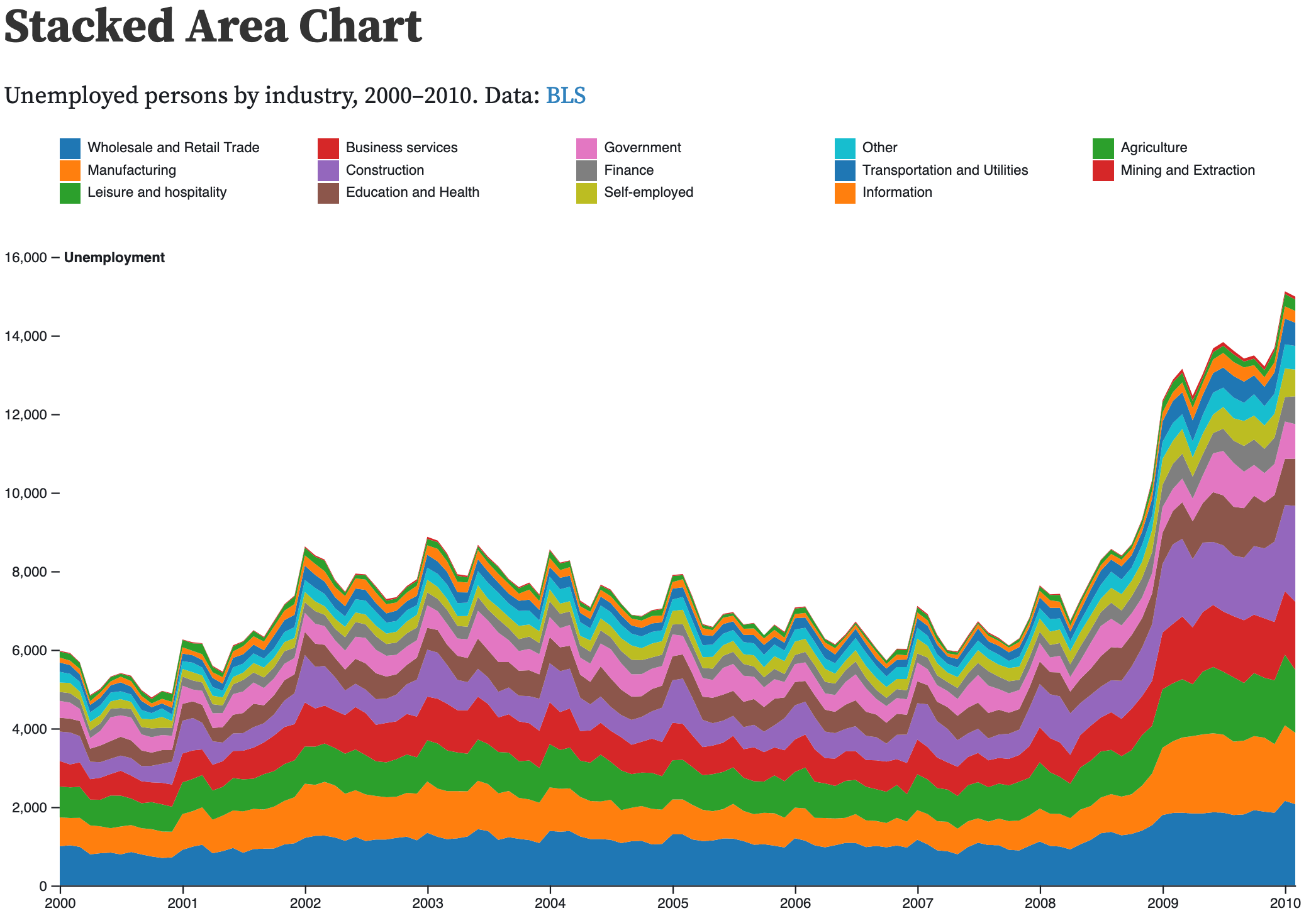
Stacked Area Charts
- Similar to streamgraphs
- Task: identify trends in total
- More accurate
- Less fancy (enjoy)
- Choose first category wisely
Other Representations
Gantt Charts
- Data: two time attributes (start end)
- Tasks: summarize duration (features), compare events, identify intersections/dependencies
- Visual representation: line, express for time, separate/order/aligned for tasks, color hues

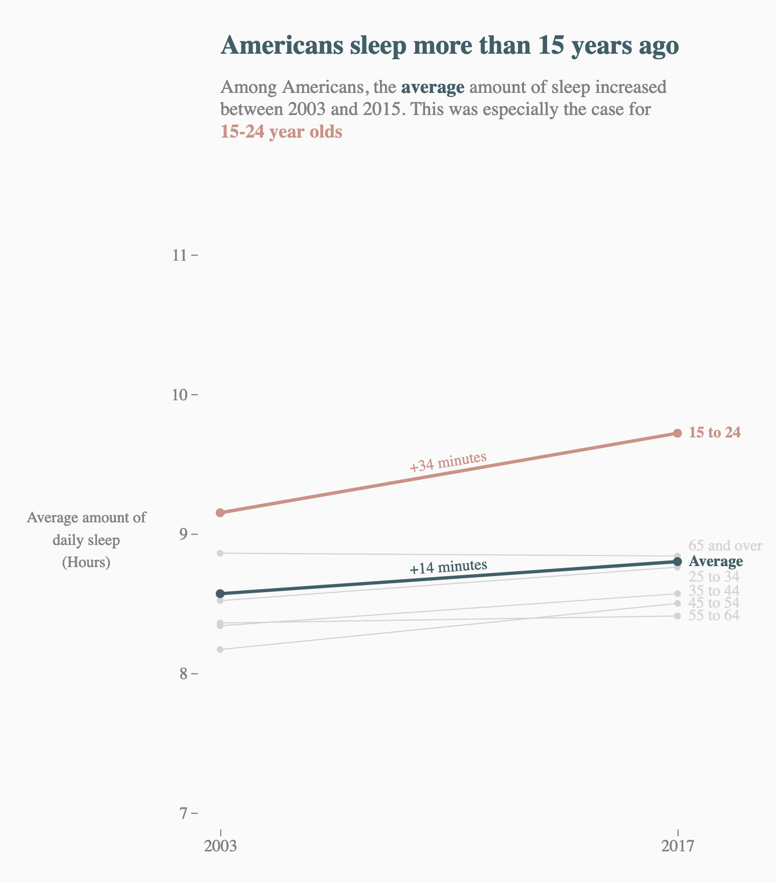
Idiom: Slopegraphs
- Two values
- Data:
- Two quantitative value attributes
- (One derived attribute: change magnitude)
- Mark: point and line
- Line connecting mark between points
- Channels:
- Two vertical points: express attribute value
- (Line width/size, color)
- Task: emphasize changes in rank/value
- Scalability: hundreds of value levels
Idiom: Calendar View
- Data: table (years), one timeline
- Tasks: compare trends (by days of the week, month, year), locate outliers
- Visual representation: shape, vertical/horizontal position, color hue
- Considerations: natural view for humans, focus on common time aggregations

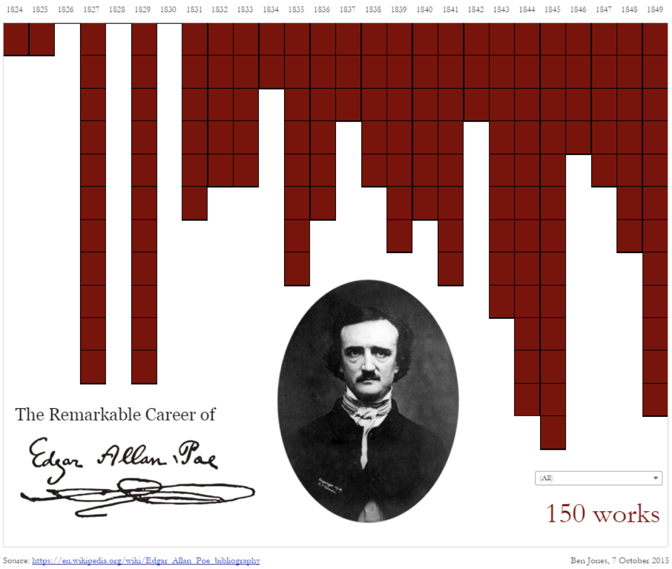
Breaking Conventions
- Presentation vs. exploration
- Engaging/evocative
- Inverted y-axis
- Blood drips down on Poe
[Slide inspired by Ben Jones]
Radial Idioms
Idiom: Radial Timelines
- Data: table (years), one timeline
- Tasks: compare trends (by days of the week, month, year), locate outliers
- Visual representation: line, radial position, color hue (rainbow :( )
- Considerations: appeals to cyclic nature of time

Idiom: Radial Barchart
Modern Representations
Idiom: Horizon Charts
- Data: table, many timelines
- Tasks: compare trends and similarities (with many), locate outliers
- Visual representation: line, vertical position, color luminosity (quant divergent)
- Considerations: uses much less space

Joyplots
Idiom: Connected Scatterplots
- Scatterplot with line connection marks
- Popular in journalism
- Horizontal and vertical axes: value attributes
- Line connection marks: temporal order
- Empirical study
- Engaging, but correlation unclear

Idiom: Connected Scatterplots (cont.)
- Alternative to dual-axis charts
- Horizontal: time
- Vertical: two value attributes

Timelines Revisited
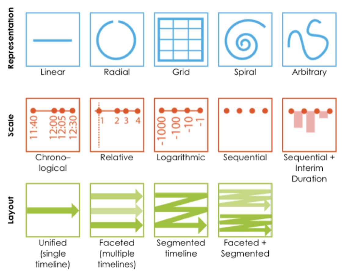
Common Derives/Tricks for Temporal Data
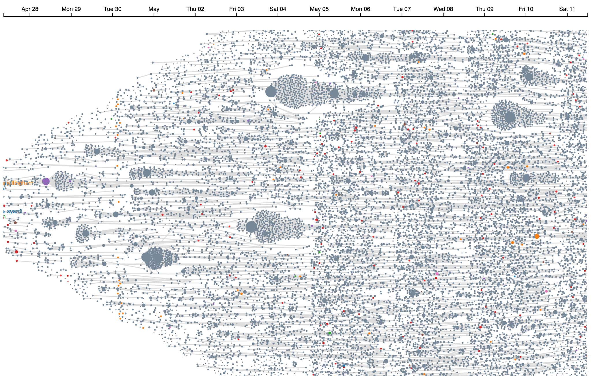
Align by Event
http://old.tweetometro.co/robots_May25.htmlAlign by Event (2)
Add/Remove Granularity
Aggregate by date parts
Window Average/Median
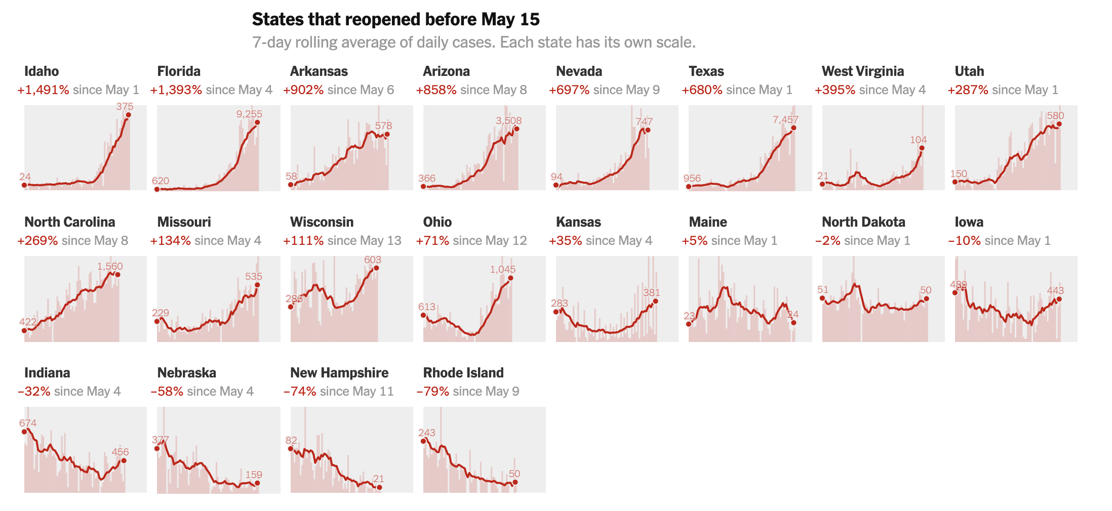
My Covid Examples
https://observablehq.com/collection/@john-guerra/covid-colombiaSeasonality
Loose Scales
HCIL Research
Time Searcher
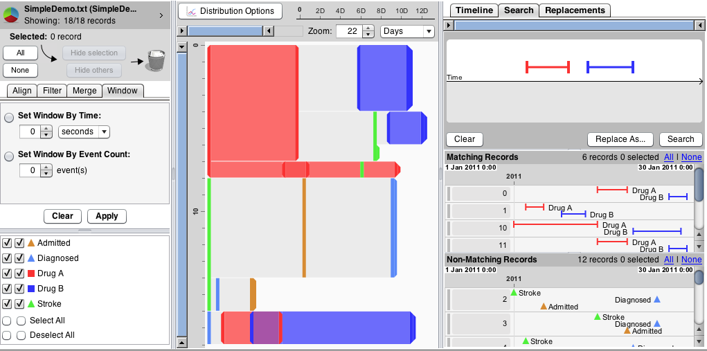
Visual Exploration of Time-Series DataLifelines

Lifelines (cont.)
LifeLines for Visualizing Patient RecordsLifelines 2

Similian

LifeFlow

LifeFlow How-To
LifeFlow Demo
EventFlow
EventFlow Demo
What We Learned
- Line charts
- Area charts
- Other representations
- Radial idioms
- Modern represtations
- HCIL work on temporal
- Tips